Thursday, 19 December 2013

Production Of Ancillary Work: What I Have Done So Far...

Almost Done...

This is where i have got up to so far in creating the front panels of my digipak. I have used my own wall and have blurred the image so they fit well together. I have added the artists name, album name and track-list. The barcode, company logo and the copyright information has also been added. I am almost done, i just need to check spelling mistakes and to see if everything is the right proportion etc.


Production of Ancillary - Font Testing

I discovered this amazing software named 'font book' which is a quicker and funner way to test out and preview different fonts to use for my CD cover

Tuesday, 17 December 2013

Production Of Ancillary Work: What I Have Done So Far...

So Far...

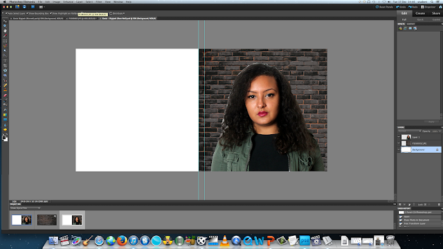
I started to put together the front panel of the digipak; changing the scale of the image of Zee and adding text. This was with the wall that i initially got my idea from. But then i started to create and manipulate my own wall as you can see in the last screenshot. As the image of Zee and the brick wall are 2 different images, it looked very fake and stood out when one was out on top of the other, so i used the blur tool to soften the edges of the image of Zee which then blurs and makes it look more together.


My Own Wall - The 2 Images Not Blurred

Production Of Ancillary Work: Creating My Own Brick Wall Background

Testing Out Brick Wall Effects

As the background for the outside panels is going to be a brick wall, i took a picture of the wall where we did part of our photo-shoot and then started to play around with the effects, filters and adjustments in photoshop. Here are a few things i was trying out with the wall. As the wall was a creamy - yellow, it was a bit difficult to make the colour darker and more mysterious. 

Original Picture


Original Image
Here again, i used a different image of the brick wall (one more far away), and continued to manipulate the wall. I found out a way to make the wall more darker with highlights between the cracks so it looks like its slightly glowing. This i think gives off great effect, it relates well to our genre and the concept of the urban, gritty look which would work well with the image of Zee.


Production Of Ancillary Work: Adjusting Colour

Adjusting Colour

Before i started creating the actual digipak, i manipulated the image first by adjusting the levels and hue/saturation to make the image look more vibrant and show up the colour more. Here is the before and after image to show the difference between the non-adjusted and the adjusted.


Before

After

Photoshop SCreenshots - Choosing Fonts


These are screenshots of me experimenting with the fonts of the titles on my digipack. I didn't want to go over the top with the fonts because I didn't want my digipack to look like a teenager let loose on photoshop lol. I wanted a really simple font that was easy to read. I decided that the font highlighted was not the best font so I chose the font bellow. Its clear and simple.


I chose this mild purple colour because again I didn't want an over the top colour. It is a girly colour but is still quite urban and strong. I later changed my name to black. This is so it stands out against the light colours on the digipack. I am happy with the fonts I chose. I didn't want the fonts to be anything grafiti typed which some fellow students suggested due to our urban style video. This is because I believed it will look unprofessional and my aim was to make it look as professional as possible


So Far

This is how far I've come along with creating the front and back of the outside of my cd cover


Still have to add more information and the track listing to the back

Mock Up of Advertisment


This is the mock up of my advertisement. Although my attempt at drawing it is, is very poor lol, my vision for the final product looks much better. I wanted to make sure it looks like an advertisment for the music industry not the film, which I have noticed some previous student work does which is why i decided to include a picture of the front panel of my digipack.

Final Mock Up of Digipack


This is the front and back of my digipack. This is an improvement from the mock up I had last week. It is more detailed as well as annotated. After a chat with Rebecca I made a few changes. I scrapped the idea of the brick wall as carrying continuity with the brick wall throughout the digipack will be difficult and may not look as professional and realistic as I want it to. It may look weird if some parts of the digipack are infront of a brick wall and some are in a studio. I also scrapped the idea of having and image of me on the back of the digipack. THE WRITING ON THE BACK WILL NOT BE BLUE, I JUST COULDN'T FIND A BLACK OR WHITE FELT TIP LOL


This is the inside of my digipack. I wanted to keep it simple because if I start adding random bits and pieces such as acknowledgments, the digipack may begin to look amateur which is NOT what I want. This is also annotated.

All writing throughout the digipack will be white or black, depending on what looks better once I begin photoshopping and the fonts will be a block print.


Sunday, 15 December 2013

Ancilary Planning - Pictures Shortlist

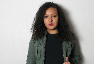
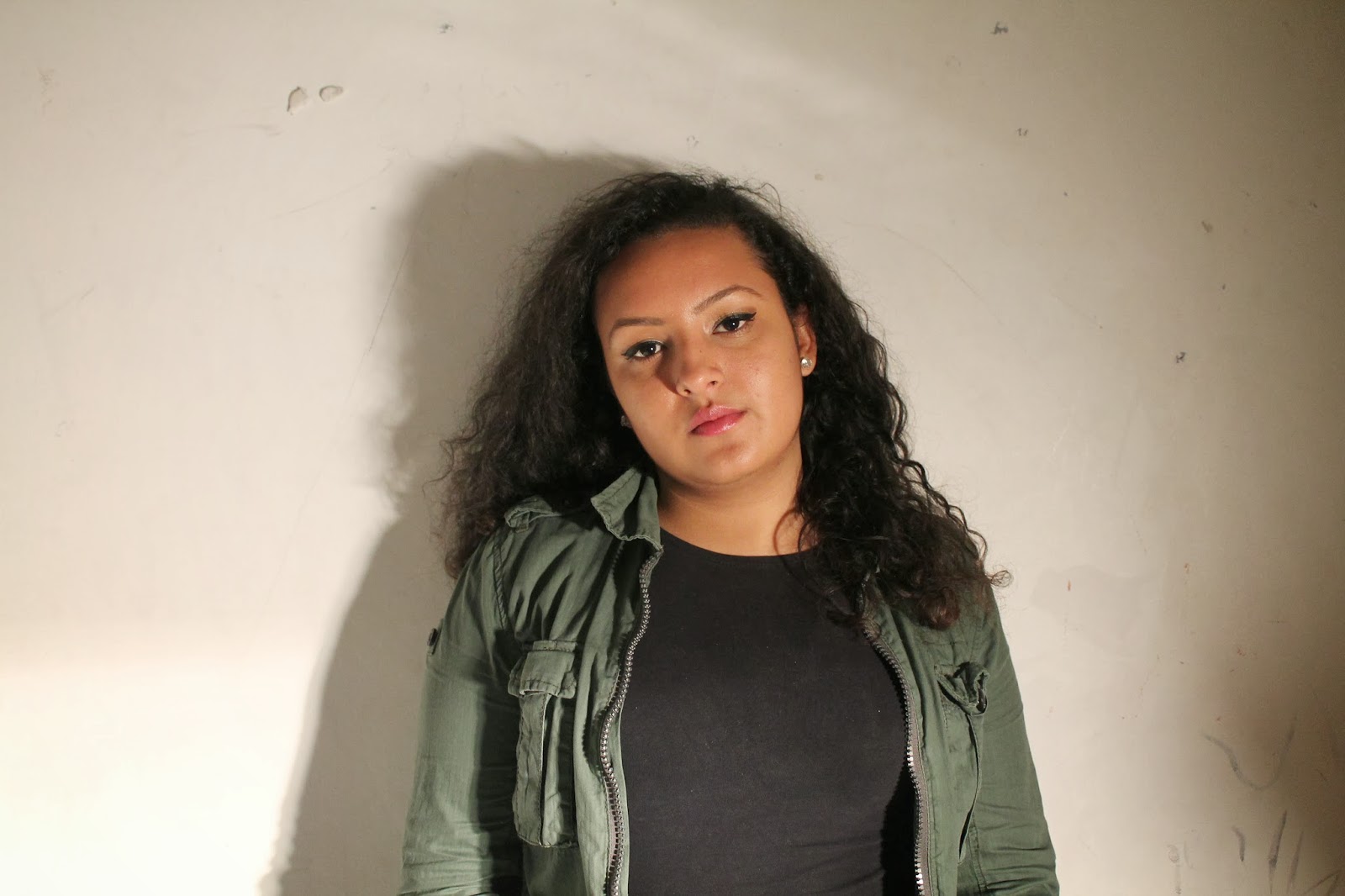
Here is a shortlist of pictures we took that I liked in particular. We took quite a few and now I have shorlisted a few that I could potentially use. Even though these are studio shots, they still have an urban essence about them through my body langauge and costume.


Thursday, 12 December 2013

Ancilary Planning - Colour Schemes

I didn't want to go over the top with too many colours. I wanted to stick to 3 basic, plain colours throughout my ancillary work. I have an idea of the colours I would like to use however once I get on to photoshop my ideas my change as I will experiment with what colours look good.

I don't want to use any bright pinks or bright bold colours. My writing will be definitely be black as I think that black works well with any colours I may decide to use as it stands out well. Bright colours give connotations of love and happy music whereas I want to carry out my urban theme from my video, for synergy purposes.

I really like the background colour on this album cover. It is femanine and pretty yet still gives urban connotations and gives a sense of girl power along with the image of the girls. I'd like to use a similar background colour on my digipack once I get started.


Wednesday, 11 December 2013

Planning Ancillary Products - colours

I wasn't sure of the sort of the colours  and design I should incoporate within my own digipak, or the colours of the fonts so I decided to do some research on real artists and compare their digipaks and gain a general idea of the sort of colours I should be using.

Marina and the Diamonds

 Marina has used neutral colours here, which all work well together. She has used a white coloured font on the outside of the digipak which is very effective and stands out and has also kept the font the same for the album title, artists name and track listing. The Black coloured font used for the artist name and album title on the actual CD also stands out against the metallic grey background, and connects well with her dark hair and dark eyes, which are all amplified in the images of her on the outside panels of the digipak. 

With this digipack, Marina has used a more crazy, variety of colours however, despite this, they all seem to work well together regardless. She uses a different range of pastel sort of colour though focuses more on pinks, purples and blues, though she still keeps the sophisticated feel to her digipak. 

Rihanna.

With this digipak, which I really love, Rihanna has also kept all neutral colours, relating the newspaper design printed on her CD to her album name 'Talk that Talk' and having a media product such as a newspaper printed across her CD. All images and text are in black and white, except her track listing, which stands out in a bold red. This is very effective as it puts great emphasis on the songs on the album which are the main point of an album - the songs.

I have gained a lot of ideas and inspiration after reviewing these digipaks, as they are all so different but each have something different to offer.

Planning Ancillary Products: My Eye Is On This...

Potential?

I was draw towards this image to use as my digipak cover. Isn't is a coincidence that it looks similar to the mock up i drew before we did the photo-shoot? Haha


Planning Ancillary Products: Photo-shoot - A Few Photos That I like

Photo-shoot! - Shortlisted 

Me and the group went out to take photos for our ancillary work. We took over 200 photos with 3 different cameras, all in one day. Here i have short-listed them to a few that i think would work well with the either the digipak or the advertisement.

The concept i was going for was the brick wall look, which would represent the urban environment the artist is in which was portrayed in the music video; which links with our genre. As our synergy has changed (as explained in a previous post), my ideas of how i want the urban look to come through my ancillary work is explained in my mock up of the digipak. My VAD tutor - Rachel, is a photography teacher and she borrowed us a good camera to take the photos with, however when we was taking the pictures the battery ran out, so we only got like 3 with the camera we got given; and had to take the rest with the still camera from Media. We had to rush as well, we were running out of time as we had to get to the screen on the green for the music video viewings. 


My tutor said that we can come back and use the photography studio in the workshop time, and that we can use the good Nikon camera; which she wasn't able to give us before as we were going outside and leaving the college site. These pictures were planned to be in front of a plain white wall so they look simple and professional. Also we can edited them in Photoshop, crop them, colour them or just do anything we want, so a plain white wall was a good choice as we can do various things in post production. We had a choice of 2 different types of lighting as well; one that would create a soft, commercial, 'magazine' type of look, and the other that was stronger and would create a bold, harsh look with shadows.

Thinking...


Zee Having A Bit Of Fun... :-)


Production - Ancillary

We used 3 different cameras to take shots for our ancillary products! First of all we used the still cameras the media department provide. The pictures came out okay but not great. So we got the idea to ask the photography department to borrow their studio and cameras during their workshop. They allowed us to borrow their Nikon and Cannon still cameras. 

At first Euginie and I were confused as to how they work but eventually we got the hang of it.
  I did my hair and make up similar to how it was during the video and we snapped away. We took over 200 pictures so I will have to make a short list.

Tuesday, 10 December 2013

Planning Ancillary - Album Title

ZEE.

Is the name I have chosen to label my album. 
Though the name is simple, is provides impact, as this will be the first released album by a new and upcoming artist - Zee Stevenson. 
Labeling the album 'ZEE' draws attention straight away to the artist, as all images of the advertisement and digipak will be focused on Zee and Zee only, and with the music video containing a range of establishing shots of Zee as an artist all is focused on her only, without attention being drawn in any other direction. I felt 'ZEE' was appropriate. 
The title is HER. The music video is all about HER without a story-line, the music video pretty much is just focused on capturing Zee in as many different locations all over London as possible - exhibiting her street, urban image to her audience.

First Draft of My Mock Up


This is my first attempt at the mock up of my digipack. Its not very detailed and is quite poor if I'm completely honest. However I will be working on this in the next few days in order to have more of an idea of what I want to create when I begin working on photoshop.

Planning Ancillary Products: Magazine Advert Mock Up


Planning Ancillary Products: Digipak Mock Up - Inside Panels

Mock Up! - Inside Panels

This is my mock up of the inside panels of the digipak. I wanted to keep it simple and about the artist, therefore having an image of her on one side (this might change in scale), and the cd on the other.


I decided not to have any writing on the inside panels as well. The colour scheme would be the black white and grey

Planning Ancillary Products: Digipak Mock Up - Outside Panels


Mock Up! - Outside Panels

This is my mock up of the outside panels of the digipak. My idea is to have a Zee, the artist on the front cover, in a close up as this is her first album and it should represent her; and a close up would be ideal.


As i would use a brick wall as the background for the front cover, which represents the urban area she is in (that is also portrayed in the music video 'Witches Brew'), i would want to put a colour wash or tint or something on it like shown in the image on the right. This will give off a nice effect, then to have Zee in front of the wall as shown in the drawing. This will also work well with her costume as she is wearing a carky jacket and redish lip stick, so she will stand out against the wall, and still portray that urban, ghetto type of look.